I had the pleasure of taking a walk around Melbourne CBD and Richmond with Fiona Gruber, who interviewed me for ABC Radio National’s Blueprint for Living program on 23 May. We talked about some of my favourite ghostsigns, and the ways that intriguing stories from the past are hidden in plain sight in old signage and public typography. Listen to the program here.
A chat with 30 Books
Stella Glorie of the Aussie book blog Thirty Books recently interviewed me about my novel Death of a Typographer. We had a lovely chat about typography, Dutch design, men writing women characters and avocados. Stella also asked me for some recommendations of Australian books I’ve recently enjoyed – I mentioned Nick Earls’ Wisdom Tree novellas, Vanessa Berry’s Mirror Sydney and Stephen Banham’s Characters: Cultural Stories Revealed Through Typography. Here’s the video. Make sure you check out Stella’s other videos too and follow her blog, Thirty Books.
A selection of books about type
I’m no expert on typography, just a fan, so in the course of researching and writing Death of a Typographer I educated myself by reading many books about type. I spent months in the Redmond Barry Reading Room of the State Library of Victoria, sitting in the typography section, browsing through a great selection of works on the history and practice of typography. I also ended up buying quite a few books for my own collection. If you’re interested in delving further into fonts, glyphs, adnate serifs, swashes and ligatures; if you pine to know more about typographers from Aldus Manutius to Zapf, then here are a few books you will enjoy.
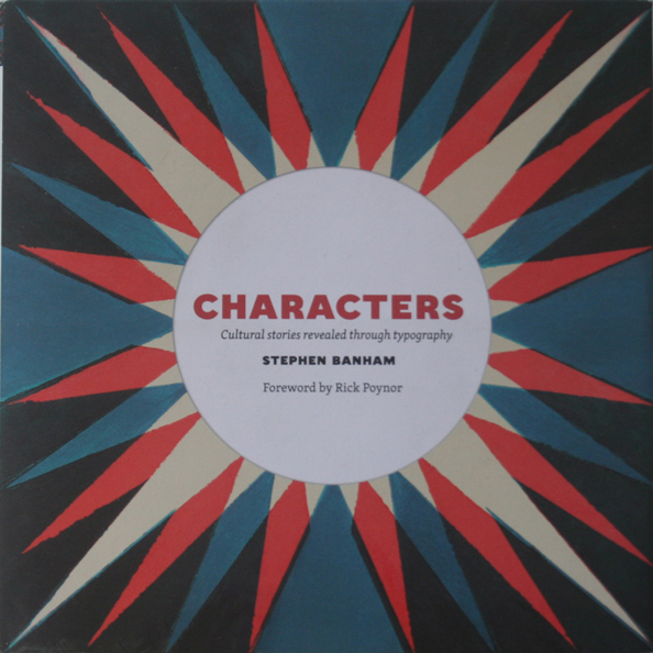
Characters: Cultural Stories Revealed Through Typography by Stephen Banham
Type is not just what appears in books: the term can embrace all kinds of letterforms. In this copiously illustrated book, accompanied by witty and informative text, Stephen Banham takes us on a tour of Melbourne’s public typography. He discusses the stories behind well-known icons such as the neon ‘Skipping Girl’ sign and Pellegrini’s cafe, as well as lesser known delights such as the historical logos of Melbourne’s fire services, old painted adverts, and parking and traffic signage. Whether in Melbourne or elsewhere, Characters is guaranteed to open your eyes to the typographical delights of the city.

Type: the Secret History of Letters by Simon Loxley
Simon Loxley tells the story of type, focussing on how it developed through the printed word. On the way we encounter some of the great names of type, beginning with Johann Gutenberg, credited with inventing moveable type in the west, along with critical figures such as William Caslon, Frederic Goudy, Jan Tschichold (creator of the New Typography, later a refugee from Nazism and the designer of Penguin Books) and Edward Johnston, who designed the font used on the London Underground. There are fascinating anecdotes along the way, including the story of why obsessive publisher Thomas Cobden-Sanderson threw all his type into the river Thames. To inform yourself on the history of type, this is the book.

The Elements of Typographic Style by Robert Bringhurst
Bringhurst is both a poet and a typographer, and this classic work is essential reading on the aesthetics of type. He explains the differences between font families such as Renaissance, Neoclassical, Baroque, and Modernist; provides sound principles for font choices (“Choose faces that suit the task as well as the subject”); and emphasises the value of tradition while not rejecting innovation. I particularly appreciated his lengthy glossary of terms, including such gems as ‘adnate serif’ and ‘lachrymal terminal’ (it looks like a teardrop). A work for type professionals and design students as well as general enthusiasts.

Just My Type by Simon Garfield
This jokey, accessible book about type by the prolific Simon Garfield was a bestseller a few years ago. He goes into the stories of several well known fonts – including the much mocked Comic Sans, Gotham (which is said to have helped Obama win the presidency), Futura (the font sent into space) and Brush Script. Having grown up in the UK, I particularly enjoyed his chapter on how British motorway signage evolved as it did. Will make you think about the psychological and emotional effects of certain fonts.

Amsterdam in Letters by Maarten Helle
This book is simply marvellous – a collection of photographs of gorgeous public type that can be seen on buildings in Amsterdam. Focussing on letterforms as part of architecture, photographer Martin Helle shows us letters of every conceivable size, shape and material: carved in stone, cast in metal, shaped out of bricks and mosaics … There is little in the way of commentary, you are simply invited to let your eyes wander over these fabulous letterforms, which reveal Amsterdam to be one of the world’s most type-rich cities. This book was a source of inspiration for the Amsterdam chapter of Death of a Typographer.

Typographic Universe by Steven Heller and Gail Anderson
This book takes typography out of the printing office and into the world at large, where letterforms can be seen, found and made out of literally anything: clouds, fruit and vegetables, utensils, Doritos, bones, vapour trails, shadows, random sights in the urban environment … Once you have looked at these photographs, you will start to see letterfoms everywhere. Inspired by this book, I had my hero Floogstraten create a font based on an aerial view of the canals of Amsterdam.
A few books of the year
I’ve managed to get through quite a few books in 2019 – about 40, I reckon, not including ones I left unfinished for whatever reason (just couldn’t plough through As A Man Grows Older by Italo Svevo, which tbh I only attempted for the title alone.) Some of my reading highlights of 2019 are listed below:
Insomniac City by Bill Hayes
Bill Hayes is a New York-based writer and photographer. He was also the partner of the neurologist Oliver Sacks. The book is about Hayes’s relationship with Sacks, whom he met close to the end of Sacks’ life. It is also about wandering New York, often by night – Hayes is an insomniac, hence the title – and his encounters with a motley collection of New Yorkers, illustrated by poignant photographs. There’s a gentle humour that runs through the book, and the love between Sacks and Hayes is beautifully captured in snatches of dialogue and vignettes. Since I love urban walking and photography, am an admirer of Oliver Sacks, and am dealing with personal loss myself, this was the perfect book for me this year.
QUOTE:
‘A languid Sunday, afternoon turning into evening, evening into night, night to morning.
“I just want to enjoy your nextness and nearness,” O says.
He puts his ear to my chest and listens to my heart and counts the beats.
“Sixty-two,” he says with a satisfied smile, and I can’t imagine anything more intimate.’
from Insomniac City by Bill Hayes
*
An Anthropologist on Mars by Oliver Sacks
I first read Sacks probably 20 years ago, but revisited this book after reading Bill Hayes (above). It’s a fascinating account of several patients that Sacks treated during his career as a neurologist, including a surgeon with Tourettes, a painter who loses his ability to perceive colour, and a blind man, Virgil, who recovers his sight in his 50s. The last of these is the most poignant story: rather than being the miracle everyone had hoped for, sight turns out to be a disaster for Virgil, because his brain is unable to decode the information it receives from his eyes. He goes from a functioning blind man to a state of depression, “between two worlds”. This book is full of fascinating reflections on the ways our brains control what we think we know about the world, and even who we are. I enjoyed it for Sacks’ elegant literary style, and his approach to these incredibly complex questions, which wears its learning lightly and is characterised by doubt rather than certainty.
QUOTE
“Now, at last, Virgil is allowed to not see, allowed to escape from the glaring, confusing world of sight and space, and to return to his own true being.”
from An Anthropologist on Mars by Oliver Sacks
*
The Friend by Sigrid Nunez
This novel was recommended to me by a few people. The narrator is a writer who inherits a Great Dane when a close friend dies. Despite not being a dog lover she forms a bond with the animal, which helps her to process her grief at the incomprehensible fact of her loss. It’s a simple tale, and besides the spare, witty writing what I enjoyed most were the apt quotes from other writers with which Nunez loads her narrative, along with her acerbic observations on marriage, the New York literary scene, and university teaching. It’s not a saccharine Hollywood story, there are no simple answers, but it does somehow leave you with a sense of positivity.
QUOTES
“The thing that keeps me from becoming a complete misanthrope is seeing how much dogs love men.”
“What we miss – what we lose and what we mourn – isn’t it this that makes us who, deep down, we truly are.”
from The Friend by Sigrid Nunez
*
Mother of Pearl by Angela Savage
I confess that I probably would not have picked up a novel about surrogacy were it not written by a friend, but when I did read this book I found it enjoyable and thought-provoking – which shows the benefits of getting out of your literary comfort zone. Angela Savage’s novel focuses on three women: an Australian, Meg, who wants to have a child by any means possible; Mod, the Thai woman who will carry the child to term for a fee; and Meg’s sister, Anna, a judgemental aid worker who disapproves of her sister’s actions but supports her out of loyalty. This is an ethically complicated area, and Savage allows all sides to emerge through the story. Her characters are portrayed as complex, flawed individuals, negotiating a path between their desires, cultures and morality. As with all of us, their motivations are far from pure and simple, and at times murky. Savage’s descriptions of Thailand are evocative and obviously based on personal knowledge of the place and culture. Unlike some literary novels this one has narrative drive, and is genuinely moving.
QUOTE
“We’re not in this to be nice to people, Anna. We’re in this to have a baby. It’s a business, OK? However else you want to dress it up, at the end of the day we’re paying for a product.”
“A product?” The indignation Anna felt on her sister’s behalf gave way to anger. “We’re talking about a baby here, Meg, not a bloody product.”
from Mother of Pearl by Angela Savage
*
The Silent Woman: Ted Hughes and Sylvia Plath by Janet Malcolm
This is a brilliant investigation of the perils of biography. Janet Malcolm, veteran journalist of the New Yorker, enters the fraught world of Hughes-Plath scholarship, riven with feuds, partisanship, and jealousy, and asks: can we ever really know the truth about someone’s life and death? In the course of her research, Malcolm talks to several biographers, and to many of the surviving participants in the controversies that followed the publication of their books, including Ted Hughes’ ferocious sister Olwen, who for many years attempted to control the narrative. Malcolm broadly comes down on the side of Hughes, but whether or not you agree that he has been unjustly portrayed as the villain of the piece, this book raises fascinating questions about the impossible task facing biographers. Malcolm wants to challenge our tendency to like our narratives to be simple and unchanging, and the ways we choose what to believe based on the side we are on, rather than deal with the mess that is real life. This book also contains what is my single favourite quote of the year, which is below.
QUOTE
We all invent ourselves, but some of us are more persuaded than others by the fiction that we are interesting.
from The Silent Woman by Janet Malcolm
*
Shady Characters: The Secret Life of Punctuation, Symbols, and Other Typographical Marks by Keith Houston
Well, I had to have one book like this on my list … Houston provides a racy account of the origins and history of some of the lesser known punctuation marks, including the pilcrow, asterisk, dagger and the @ sign. On the way, we venture into the worlds of Biblical scholarship, computer science, and (of course) typography. Great bedside reading and full of the kind of quirky historical facts I adore.
Fonts and fiction
(First published in the Victorian Writer magazine, October 2019)
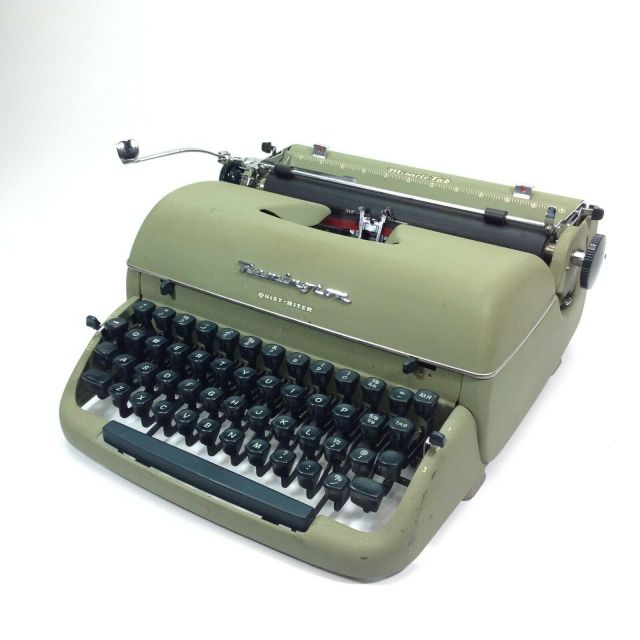
The first type I cared about was produced by my parents’ Remington Quiet-Riter, a 1950s machine on which I smashed out my earliest stories as a child. The not-really-very-Quiet-Riter, laughably described as ‘portable’ although it weighed roughly the same as the family car, was a staple of office typing pools in the mid-20th century and the weapon of choice for thousands of novelists, poets and journalists. It produced sturdy rows of letters resembling little mechanical insects. The Quiet-Riter had its quirks: there was no zero or numeral 1, you had to use a capital O or I for those, and the exclamation mark had to be assembled from a fullstop and apostrophe. The capitals were scarcely taller than the lower case letters, a quality that typographers refer to as ‘large x-height’. Certain letters had huge serifs: the lower case i and l looked as if they were standing on a diving board, while other letters which you might expect to have serifs had none. The ribbon provided two colour options: black and red. I used red to emphasise key words like WAR or MUST, but I suppose in offices it came in handy for OVERDUE and PRIVATE, or possibly (in the world of John Le Carre) TOP SECRET. You had to hit the keyboard with force to imprint the type on the paper: I developed a four-fingered stabbing technique which I still use today. If I made a mistake there was no way to fix it in that pre-Tippex era, so the choice was to type another letter even more forcefully over the top (my method, aged ten) or to start all over again.
At the time I paid no attention to the actual shape of the letters – my focus was the story on the page, and I accepted the quirks of my Quiet-Riter as a fact of life. I realised that my typed and stapled books with their hand-drawn covers and Sellotape spines were not exactly like the books I read (and Douglas Adams probably didn’t have to ask his mum to write the foreword) but I considered them pretty professional. I imagine that publishers’ slush piles used to be heaped floor-to-ceiling with manuscripts not unlike the ones I was producing. It may have been basic by today’s standards, but the Quiet-Riter’s typeface was the font that made me feel like a writer.
Later, with rows of orange and green Penguins on my shelf, I unconsciously absorbed design principles while I devoured the words. Those pages, with their centrally placed headers, justified text, and pleasingly spaced lines, were set in classic fonts like Granjon, Bembo and Garamond, variants of type in use since the Renaissance. I paid no attention to that: I simply accepted that this was what literature looked like. I didn’t notice the subtle touches that typesetters use: the ligatures of letter combinations like ‘fl’ and ‘ff’, and the careful kerning to avoid unsightly gaps between letters; though I may have noticed typographical oddities like the use of ‘&c’ instead of ‘etc’ in 19th-century novels. The fact that I missed all this proves that the type was doing its job. Beatrice Warde wrote that type should be like a ‘crystal goblet’ – it’s the wine that matters, not the vessel that’s holding it. But without the expertise of those unknown typesetters, my reading experience would have been more arduous, less pleasant.
With the advent of word processing, thanks to Steve Jobs, who famously studied calligraphy before turning to world domination, every part-time typist gained access to thousands of fonts. However, being able to choose from a plethora of options from Aldus to Zapf doesn’t mean that users understand the principles of good typography. As Robert Bringhurst puts it in The Elements of Typographic Style, “Like oratory, music, dance, calligraphy – like anything that lends its grace to language – typography is an art that can be deliberately misused.” We’ve all seen texts with a smorgasbord of ill-chosen fonts vomited onto the page. All the same, people who have spent time in the company of books have an instinctive sense of what a well laid out page looks like, even if we can’t explain why.
I learned more about these matters when I became friends with typographer Stephen Banham. As a young man Stephen was hunched over a desk in Berlin, cutting letterforms from magazines and kerning late into the night. By the time we met he had his own typography studio, Letterbox, and was described as a “typographic evangelist” by the design magazine Eye. Over the course of many conversations he taught me a little about the ways that fonts intersect with politics and economics; the cultural stories embodied in letterforms; the sheer obsessive detail involved in constructing a typeface. Thanks to Stephen, I paid more attention to the fonts around me. Why does Mistral look right for a rustic French bakery; Didot for an upmarket magazine? Why does airport signage use Helvetica? Why must your resume be in Times New Roman, not Comic Sans? Did Gotham help Obama win the presidency? I began doing my own reading, and ventured into the seductive world of swashes, serifs and glyphs.

I learned that the world of type harbours obsessives and eccentrics like Cobden-Sanderson, publisher of the Doves Press, who was so determined that his business partner should not inherit his precious type that he tossed it into the River Thames, from which the exquisite letterforms are still being fished out a century later. There are tragedies, like that of the Italian poet Carlo Guidi who dropped dead when he noticed a typographical error in a book he was about to present to the Pope. Type has its heroes too, among them Jan Tschichold, a refugee from Nazism, who designed in the late 1940s the Penguin books I loved so much. There is no shortage of excellent non-fiction about type, but it struck me that this intriguing world, with its rich culture and language, has a lot to offer a novelist. I decided to combine fonts and fiction.
When I told people I was writing a novel about typography, a surprising number confessed an emotional attachment to fonts. A lawyer, passionate about human rights, told me with equal fervour that she can only write her PhD thesis using the great Renaissance font Garamond. Nick Earls declared that he prefers his books set in Bembo. A friend whose dad was an advertising man feels a tug on her heart when she sees the label of ‘Peck’s Tasty Spread’ with the lettering (in Bookman Swash) he designed using Letraset. For me, the sight of Johnston Sans evokes memories of my time commuting on the Underground, and I can hear ‘London Calling’ in the background. (In contrast, Melbourne suburban stations lost some of their character when the signage changed from Goudy to the ubiquitous Helvetica*). Consider your own favourite fonts: what stories intertwine with those letterforms?

When the time came for Death of a Typographer to go into print, it was obvious that the book needed to look typographically impressive, so asking Stephen to design the cover and select the type was a no-brainer. He picked out 26 fonts for the chapter headings, each representing a nuance of character and plot, from something called Bo Diddlioni Stencil to Graveblade, while his designs for the cover and internal pages evoked the classic 1960s Penguins that we both admire. The text was expertly typeset by Anastasia Buryak and Wayne Saunders in Mercury Text, a new take on a classic serif. Most pleasingly, the cover draws a line directly from my younger to my older self. I hear the Quiet-Riter’s clatter across the years when I look upon the author’s name, set in Typewriter.
* There is hope, though: Stephen recently alerted me that a new font has been spotted on the Hurstbridge line.
The multigeneric novel
So, what kind of novel is it?
That’s a question that throws me. Yes, my books might look and sound like crime novels. But I’ve never felt completely at home in the genre, and with Death of a Typographer, even less so – notwithstanding the blood-stained punctuation mark on the cover.
There are good reasons why genre fiction is popular. It meets a basic human need for story in a way that is sometimes disdained by more ‘literary’ works. It offers the comfort of familiarity in a world that seems to be spiralling out of control. It provides resolution and ties up loose ends in a way that life doesn’t. I’m not going to get into the debate about whether literary novels are better than genre novels: broadly I agree with the idea that you can find good writing, as well as pretty lame stuff, in both camps. What I want to discuss is my dream of having my cake and eating it: the multigeneric novel.
One problem with multigeneric novels is that publishers don’t know how to market them. If a novel is rural crime, medical romance or gun toting western, then it’s clear who the audience is and where it will be found in the bookshop. When a book crosses those lines, things become messier. Since decisions about publication are largely made by sales and marketing teams, that creates a problem for the author who naturally wants their work published. The question, frustratingly, is not ‘Is this any good?’ but ‘How will we sell this?’
The success of some multigeneric novels demonstrates that there is an audience for them. David Mitchell’s Cloud Atlas contains six very loosely connected narratives which employ tropes and techniques associated with historical novels, social comedy, political thrillers, sci-fi, epistolary novels and dystopian fiction. In his later novel The Bone Clocks he ventured into fantasy, as a gang of time-travelling, shapeshifting, ultraviolent demons tracked each other through the pages in a way you wouldn’t expect from a writer shortlisted for the Booker Prize. As a reader, I’m prepared to join Mitchell on this journey because he is a fine writer and storyteller, even when he ventures into genres I wouldn’t normally read. I’m not saying that multigeneric novels are necessarily better: but they offer a different kind of reading experience. It’s like listening to an album by a band intent on musical experimentation – The Beatles’ White Album, say, rather than The Strokes Is This It.
Jennifer Egan’s wonderful novel A Visit from the Goon Squad consists of a sequence of loosely related stories that jump between comedy, tragedy and satire, including a lengthy chapter in the form of a Powerpoint presentation, probably the first such chapter in the history of literature (also the first Powerpoint in history to bring tears to the reader’s eyes rather than putting them to sleep). When you reach the end of the chapter you are cheering for the characters and the writer for pulling it off (and getting it past the marketing department).
I find myself wanting to write multigeneric fiction for much the same reasons I like reading it. I like the element of surprise – oh, I thought this novel was one thing, now it’s something else. The diverse elements of the narratives appeal to different parts of myself. None of us is one thing, we have complex, contradictory identities and histories, personalities and obsessions, and a good novel speaks to us in many ways. Why shouldn’t there be jokes on one page, serious stuff on the next? Why not realism here, and the supernatural there? It’s risky, of course. I don’t always have the skill to pull it off.Some readers objected to the appearance of ghosts in my first novel, Ghostlines – the noirish realism of the opening chapters created an ambience that some readers thought inhospitable to spirits, and it lost me at least one publisher. Others loved it, though.
My new novel Death of a Typographer is another, more ambitious attempt. The main narrative is a kind of playful not-quite-realism, peopled by characters obsessed with typography. The action is punctuated by murders, which the protagonists have to solve, though I wouldn’t call this a pure crime novel – my model is more Douglas Adams than Ian Rankin. The interpolated narratives go down other paths – a supernatural tale, a love story, a political thriller – and in those chapters I’m trying to be a disciple of Mitchell and Egan. I’m aware that by writing this way I’ve created a rod for my own back, sales and marketing-wise. What is this novel? Who knows? Who cares? All I can say is that each of those stories is one I wanted to tell, in the way I told it. In some magical way, if I’ve succeeded as a writer, it all makes sense. And if I haven’t succeeded – as you never do, not completely – there’s always the next book.
Interview in the Sunday Age
I was interviewed by Thuy On for the Sunday Age and the Sydney Morning Herald about my novel Death of a Typographer. Thuy is a fan of the book, which she describes as “a romp of a book, sprightly and erudite”. We had a lovely chat about fonts, fiction and typography – you can read the interview here. Better still, order a copy of Death of a Typographer.
Obsession. Murder. Fonts.
My new novel, Death of a Typographer, a murder mystery about type, was published in September 2019 by Australian Scholarly Publishing. You can order it here. It includes more than 30 fonts, excellent typography, and 300 pages of tasty nutritious fiction. Thuy On in The Sunday Age called it “a romp of a book, sprightly and erudite.”
And here’s the back cover blurb.
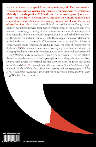
If you’re curious about those little marks that Stephen has used to divide the paragraphs, they are known as pilcrows. The pilcrow has an interesting history, originating as a mark made by medieval scribes, long before its current incarnation on your computer screen as a ‘hidden character’ denoting a new paragraph. As it happens there are quite a few hidden characters in my novel too, so it’s appropriate that Stephen has used it here.
