(First published in the Victorian Writer magazine, October 2019)
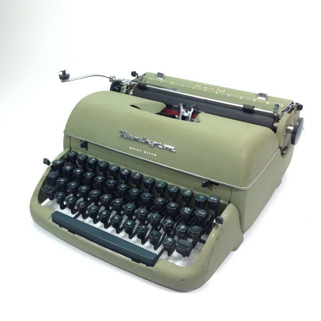
The first type I cared about was produced by my parents’ Remington Quiet-Riter, a 1950s machine on which I smashed out my earliest stories as a child. The not-really-very-Quiet-Riter, laughably described as ‘portable’ although it weighed roughly the same as the family car, was a staple of office typing pools in the mid-20th century and the weapon of choice for thousands of novelists, poets and journalists. It produced sturdy rows of letters resembling little mechanical insects. The Quiet-Riter had its quirks: there was no zero or numeral 1, you had to use a capital O or I for those, and the exclamation mark had to be assembled from a fullstop and apostrophe. The capitals were scarcely taller than the lower case letters, a quality that typographers refer to as ‘large x-height’. Certain letters had huge serifs: the lower case i and l looked as if they were standing on a diving board, while other letters which you might expect to have serifs had none. The ribbon provided two colour options: black and red. I used red to emphasise key words like WAR or MUST, but I suppose in offices it came in handy for OVERDUE and PRIVATE, or possibly (in the world of John Le Carre) TOP SECRET. You had to hit the keyboard with force to imprint the type on the paper: I developed a four-fingered stabbing technique which I still use today. If I made a mistake there was no way to fix it in that pre-Tippex era, so the choice was to type another letter even more forcefully over the top (my method, aged ten) or to start all over again.
At the time I paid no attention to the actual shape of the letters – my focus was the story on the page, and I accepted the quirks of my Quiet-Riter as a fact of life. I realised that my typed and stapled books with their hand-drawn covers and Sellotape spines were not exactly like the books I read (and Douglas Adams probably didn’t have to ask his mum to write the foreword) but I considered them pretty professional. I imagine that publishers’ slush piles used to be heaped floor-to-ceiling with manuscripts not unlike the ones I was producing. It may have been basic by today’s standards, but the Quiet-Riter’s typeface was the font that made me feel like a writer.
Later, with rows of orange and green Penguins on my shelf, I unconsciously absorbed design principles while I devoured the words. Those pages, with their centrally placed headers, justified text, and pleasingly spaced lines, were set in classic fonts like Granjon, Bembo and Garamond, variants of type in use since the Renaissance. I paid no attention to that: I simply accepted that this was what literature looked like. I didn’t notice the subtle touches that typesetters use: the ligatures of letter combinations like ‘fl’ and ‘ff’, and the careful kerning to avoid unsightly gaps between letters; though I may have noticed typographical oddities like the use of ‘&c’ instead of ‘etc’ in 19th-century novels. The fact that I missed all this proves that the type was doing its job. Beatrice Warde wrote that type should be like a ‘crystal goblet’ – it’s the wine that matters, not the vessel that’s holding it. But without the expertise of those unknown typesetters, my reading experience would have been more arduous, less pleasant.
With the advent of word processing, thanks to Steve Jobs, who famously studied calligraphy before turning to world domination, every part-time typist gained access to thousands of fonts. However, being able to choose from a plethora of options from Aldus to Zapf doesn’t mean that users understand the principles of good typography. As Robert Bringhurst puts it in The Elements of Typographic Style, “Like oratory, music, dance, calligraphy – like anything that lends its grace to language – typography is an art that can be deliberately misused.” We’ve all seen texts with a smorgasbord of ill-chosen fonts vomited onto the page. All the same, people who have spent time in the company of books have an instinctive sense of what a well laid out page looks like, even if we can’t explain why.
I learned more about these matters when I became friends with typographer Stephen Banham. As a young man Stephen was hunched over a desk in Berlin, cutting letterforms from magazines and kerning late into the night. By the time we met he had his own typography studio, Letterbox, and was described as a “typographic evangelist” by the design magazine Eye. Over the course of many conversations he taught me a little about the ways that fonts intersect with politics and economics; the cultural stories embodied in letterforms; the sheer obsessive detail involved in constructing a typeface. Thanks to Stephen, I paid more attention to the fonts around me. Why does Mistral look right for a rustic French bakery; Didot for an upmarket magazine? Why does airport signage use Helvetica? Why must your resume be in Times New Roman, not Comic Sans? Did Gotham help Obama win the presidency? I began doing my own reading, and ventured into the seductive world of swashes, serifs and glyphs.

I learned that the world of type harbours obsessives and eccentrics like Cobden-Sanderson, publisher of the Doves Press, who was so determined that his business partner should not inherit his precious type that he tossed it into the River Thames, from which the exquisite letterforms are still being fished out a century later. There are tragedies, like that of the Italian poet Carlo Guidi who dropped dead when he noticed a typographical error in a book he was about to present to the Pope. Type has its heroes too, among them Jan Tschichold, a refugee from Nazism, who designed in the late 1940s the Penguin books I loved so much. There is no shortage of excellent non-fiction about type, but it struck me that this intriguing world, with its rich culture and language, has a lot to offer a novelist. I decided to combine fonts and fiction.
When I told people I was writing a novel about typography, a surprising number confessed an emotional attachment to fonts. A lawyer, passionate about human rights, told me with equal fervour that she can only write her PhD thesis using the great Renaissance font Garamond. Nick Earls declared that he prefers his books set in Bembo. A friend whose dad was an advertising man feels a tug on her heart when she sees the label of ‘Peck’s Tasty Spread’ with the lettering (in Bookman Swash) he designed using Letraset. For me, the sight of Johnston Sans evokes memories of my time commuting on the Underground, and I can hear ‘London Calling’ in the background. (In contrast, Melbourne suburban stations lost some of their character when the signage changed from Goudy to the ubiquitous Helvetica*). Consider your own favourite fonts: what stories intertwine with those letterforms?

When the time came for Death of a Typographer to go into print, it was obvious that the book needed to look typographically impressive, so asking Stephen to design the cover and select the type was a no-brainer. He picked out 26 fonts for the chapter headings, each representing a nuance of character and plot, from something called Bo Diddlioni Stencil to Graveblade, while his designs for the cover and internal pages evoked the classic 1960s Penguins that we both admire. The text was expertly typeset by Anastasia Buryak and Wayne Saunders in Mercury Text, a new take on a classic serif. Most pleasingly, the cover draws a line directly from my younger to my older self. I hear the Quiet-Riter’s clatter across the years when I look upon the author’s name, set in Typewriter.
* There is hope, though: Stephen recently alerted me that a new font has been spotted on the Hurstbridge line.
