Last year I was invited to contribute to something a bit out of my normal wheelhouse: an anthology of writings based on the songs of Kylie Minogue.
I have written about songs a few times before, most notably on the excellent Stereo Stories website which has a focus on music and memoir. But this was my first time contributing to an anthology of writings on music.
The book, Spinning Around: the Kylie Playlist, edited by Angela Savage and Kirsten Krauth, was published by Fremantle Press. It includes short stories, poems and creative non-fiction by authors including Christos Tsiolkas, Alice Pung, Kris Kneen, Carrie Tiffany, Chris Flynn, Thuy On, Holden Sheppard, Ellen van Neerven and a host of others. Each piece is based on a song from Kylie’s long and eventful career.
While some authors got to choose their own song, I was allocated one. On the basis of my interest in fonts and typography, Angela kindly decreed that I should write on one of Kylie’s least well-known but most intriguing songs: German Bold Italic (GBI). In this number from 1997 – co-written and produced by Japanese producer Towa Tei – Kylie takes on the persona of a typeface. The story of how the song came to be written and recorded is fascinating, as I describe in my contribution to the book, and demonstrates Kylie’s capacity for experimentation.
Towa Tei was one of the most interesting producers/artists of the time, but far from a household name: Kylie sent him a fax (it was the 90s) reading ‘Music With You? Call Me. Kylie.’ A number of great tracks came out of that collaboration, but they didn’t end up on Kylie’s albums, as her record company didn’t like them. They are well worth seeking out, though, as is the book. (Once you’ve heard it, I defy you to get the synth hook from ‘German Bold Italic’ out of your head.)
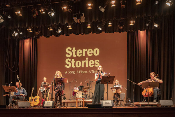
Now, if you want to hear some of the pieces from the book read out live, you have the opportunity at the forthcoming Williamstown Literary Festival 2025.
On Friday evening 20 June, the popular Stereo Stories event will include Nathan Curnow reading his Kylie-inspired poem, ‘Confide in Me’ (contributor Alice Pung will also be reading, though not her Kylie work). Details/tickets here:
https://events.humanitix.com/stereo-stories?hxchl=hex-pfl
On Saturday evening 21 June, there will be a Kylie dance party at the Newport Bowls Club. Opening with readings from Miriam Sved, Thuy On, Chris Flynn and Angela Savage, the floor will then be cleared for a dance. Details/tickets here:
https://events.humanitix.com/spinning-around?hxchl=hex-pfl
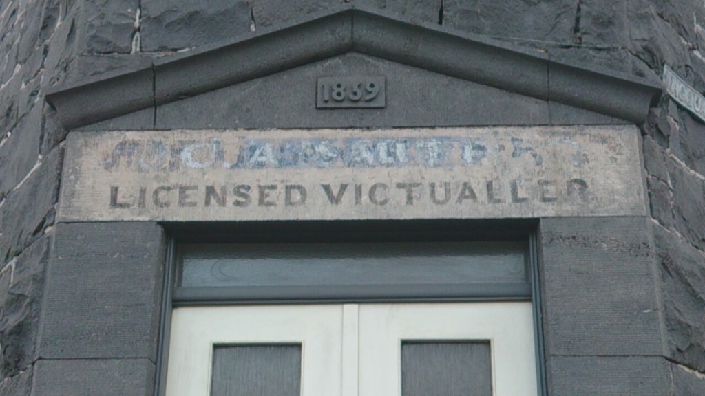
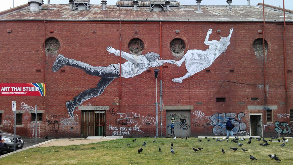
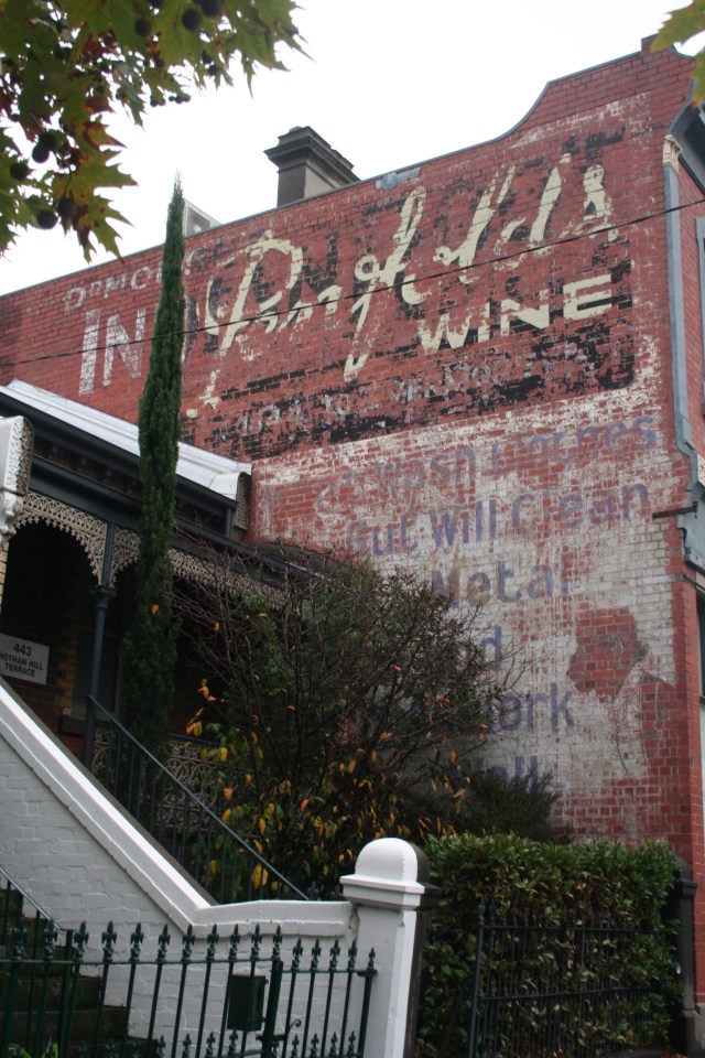
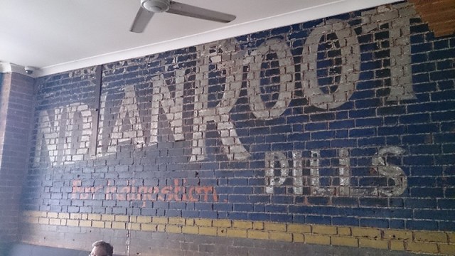
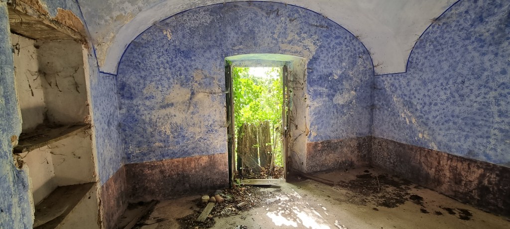
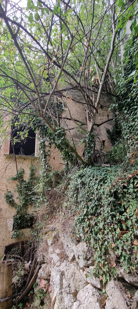
Ghost signs
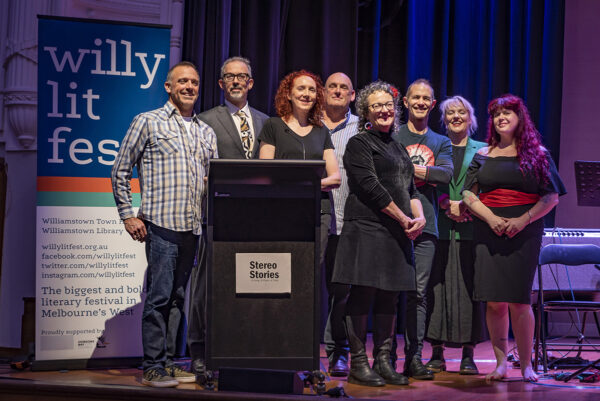
Meanwhile, in other non-Kylie news, also at the Willy Lit Fest, at 4.30 on Saturday 21st June I will be interviewing Sean Reynolds about his book Ghost Signs and old advertising signs painted on walls. Details here (search for ghost signs): https://www.willylitfest.org.au/2025-program